- Best Practices ●
- COVID-19 ●
- Industry Trends ●
- Partners ●
- Product ●
7 Packaging Ideas and Tips To Elevate Your Brand
You won’t be hard-pressed to find dull, unattractive packaging designs. And isn’t that a missed chance when you could entice customers to purchase and repurchase your products?
Effective packaging design isn’t just about jumping on every trend—it’s about getting customers to notice your brand in an overcrowded market. Great package design has the potential to turn heads, stir emotions, and persuade customers to reach into their wallets.
In this blog post, we’ll explore seven packaging ideas to ignite your creativity, make your brand stand out, and show you how you can use smart packaging design.
7 impactful package design ideas
Need some inspiration on how to introduce a new product through packaging? Are you looking for packaging ideas to kickstart your first packaging venture? Or are you searching for some unique packaging ideas to revamp your package design? Keep on reading!
(Note: The examples and images found below are ones we found during our research).
1. Add color strategically
Color is a powerful element in packaging design. Use it effectively, and it can alter a buyer’s perception of your packaging and brand. Beyond the aesthetics, color evokes thoughts and emotions.
Your choice of color directly influences your customers’ purchasing decisions. In fact, color plays a massive role in swaying consumers’ choices—did you know that 85% of customers make purchases based on color? If you’ve been waiting for a sign to incorporate a specific color, this is it!
However, selecting the right colors depends on your product, brand, and the message you wish to convey to your customers. Take the tech giant Apple, for example. It epitomizes elegance, purity, and minimalism through its products and packaging by employing white. This is one example of how one color can change how we perceive a product or brand.

While Apple’s aesthetic is monochromatic, other brands may go in the opposite direction depending on their style or products. For example, the coffee bean packaging brand below, uses a polychromatic approach, employing multiple colors to make a bold statement on its packaging.
Both bags are from the same brand, but the varying colors indicate different types of bean roasts. Instantly, customers can easily discern the bag’s differences just by noting the contrast in the bag colors. This simplifies their decision-making process without exerting too much effort.

2. Play with patterns
Like color, patterns from simple to complex—whether lines, graphics, or repeating geometric shapes—can tell a story about your product and brand.
Patterns inject vibrancy and a distinct style into packaging design, showcasing your brand’s artistic flair and personality. And perhaps the biggest perk of using patterns in package design is their impact on consumers.
Patterns can set brands apart with unique but indistinguishable pattern designs that activate instant brand recall, drawing customers to the packaging. A refined design can even convey a sense of high quality, compelling the customer to purchase.
Are you considering incorporating patterns in your packaging? First, reflect on who you are as a brand. Do you perceive your brand as playful or serious? Elegant or eclectic?
Think about what aligns more closely with your branding. It wouldn’t make sense to feature a medley of patterns on your package design if your brand leans more toward the serious side. Incorporating patterns should seamlessly complement your brand’s personality—and brand consistency will help customers spot your product on the shelf.

In the example above, this brand didn’t just incorporate vibrant colors, bold typography, and graphics; it also used a mix-match of patterns, making the packaging visually striking and captivating. It’s a playful way of showcasing brand personality.

In the example above, AESOP wines opted for a subtly playful approach. The delicate yellow patterns exude sophistication, fitting for a wine brand. The gentle hues and understated touch further enhance the bottle’s appeal and allure.

3. Go minimalist
Minimalism isn’t a novel trend, but its “less is more” philosophy undeniably holds universal appeal. Its clean, uncluttered, and simple design that emanates a sense of tranquility has captured the hearts of consumers.
The departure from loud patterns and colors to muted, clean, and stripped-down aesthetics has a remarkable way of allowing the product to take center stage, letting it speak for itself.
Beyond its chic design, embracing minimalism in packaging is also a step towards using fewer materials and reducing waste. Brands should prioritize this as a key consideration in response to consumers’ growing demand for sustainable purchases.
Winning over customers requires more than just style and surface-level claims. Brands need to convey their commitment to sustainable efforts through their package design. One effective way to do this is by adopting minimalist packaging—and incorporating a QR Code on packaging that links to the company’s sustainability initiatives.
Consider the packaging example below. It features a plastic-free cardboard material with a simple design, yet nothing essential is lacking. Functional and eco-friendly, it prominently displays the brand’s logo while spotlighting the product.
The package below is also uncluttered, displaying only key details such as the company’s logo, website, and name. Focusing solely on the package branding effectively communicates the essence of the brand.

4. Use bold typography
Typography is the visual language on your packaging. Fonts can fade into the background, leaving no lasting impression, or they can stand out, attracting the right customer to your packaging.
Often viewed as the bridge between text and images on packaging, typography plays a crucial role. But if you aim to make a statement, opting for bolder fonts will help you convey your message more effectively.
Why choose bold typography? Bold fonts breathe life into words, grabbing the customer’s attention and making a significant visual impact with minimal text.
Consider the example below from the Italian street food brand Spaghettaboutit. The playful and bold font communicates the essence of the product and brand without ambiguity.

Or take the brand Camden’s Brewery and its beer flavor, “Show off.” The typography “show off” immediately leaps out on the can with its bold white and lilac font juxtaposed against a peach background.
Customers browsing the store can quickly identify this beer flavor and may be enticed by its playful appeal to give it a try based solely on its eye-catching appearance. This demonstrates the visual impact of a bold font in just two words.

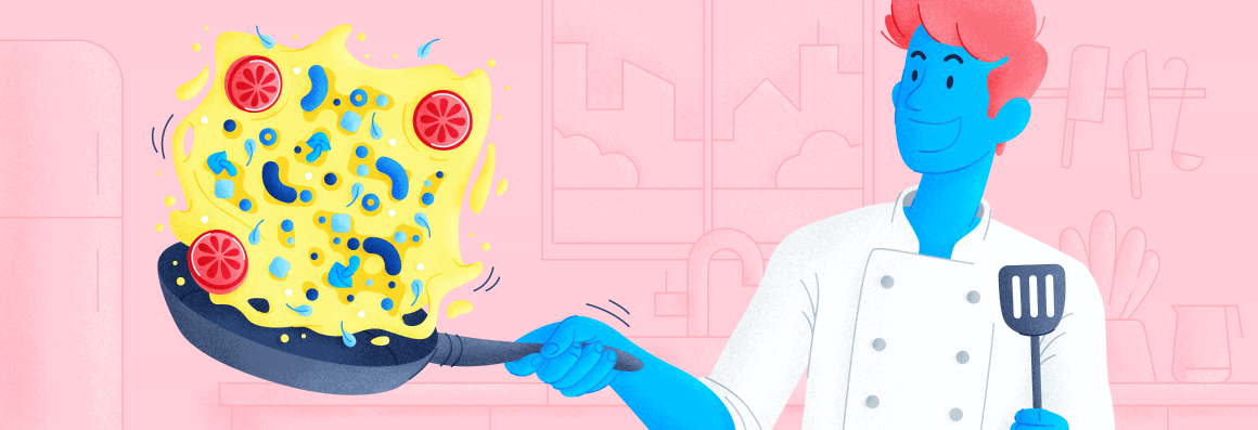
5. Use illustrations
Illustrations on packaging represent the fusion of art and package design. This could be a figure, a drawing, or a photo carefully chosen by a designer to integrate into the packaging design, visually portraying the product or narrating a story through visuals. It’s also a means of humanizing the brand and fostering a connection with the consumer.
When an illustration graces a package, it can complement the text on the packaging or convey the product’s value. Illustrations showcase the brand’s deliberate effort to conceptualize an idea and bring skilled branding and design expertise to the forefront.
Compelling illustrations can captivate customers’ attention and pique their curiosity about the product, perhaps even prompting them to try something new. Whether hand-drawn or cartoonish illustrations, they can persuade customers to take an interest in products, even in a crowded marketplace where brands fight for shelf space.
While capturing attention isn’t easy, especially when customers are loyal to their preferred brands, it’s possible to make a lasting impression still. A prime example of an illustration that captivates the observer is Le Petite Mort’s can of Black Stout.

The eerie image of a skeleton draped in what appears to be aqua paint, its skeletal form holding a heart against a backdrop of black, paints a chilling tale solely through visuals—no words required!
It’s not an image to casually pass over, especially for the target audience drawn to this specific brand style. This picture speaks volumes without uttering a single word.

Consider the company Magic Mind, which incorporated the illustration of ocean waves from its website onto its packaging to reinforce its brand identity. This packaging image invokes a sense of serenity and tranquility, mirroring the product’s ability to provide a calm and peaceful experience for its consumers—essentially reflecting the brand’s core value proposition.
6. Go retro
Retro packaging purposefully adopts an old or vintage aesthetic, harnessing its potent ability to evoke feelings of nostalgia. The retro design invites consumers to journey back in time, revisiting memories and emotions. Transporting customers to the past enables brands to foster deep connections with their audience.
Designers can infuse retro elements into packaging, incorporating vintage fonts, brand logos, illustrations, and colors. Targeting the right audience within the appropriate age group is crucial. For instance, using 80s retro packaging may not resonate as strongly with a Gen Z audience compared to evoking memories of the early 2000s.
Consider the brand Retro Brewing Company, which not only embodies retro aesthetics but also allows customers from the 80s to relive their SNES and Mario Kart memories. With cans adorned in vibrant neon colors reminiscent of the retro 80s, customers experience a nostalgic throwback that rekindles the “good old days” feeling.

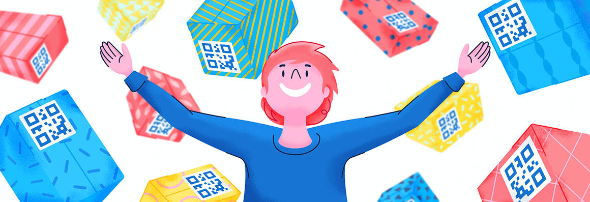
7. Leverage QR Codes
Another unique packaging idea that could be incorporated is QR Codes. Creativity might not be the first association with QR Codes, and it’s true—they’re not traditionally renowned for their creative potential. However, due to their versatility, they can serve various functions.
Whether you aim to optimize package real estate, adopt a minimalist style, or infuse modernity without compromising packaging design, this digital tool offers limitless possibilities.
One modern smart packaging solution that can help you stay ahead of the curve is the 2D Barcode. This GS1-compliant QR Code is ideal for consumer packaged goods and product labels, helping consumers make smarter choices.
You can customize the code to align with your packaging design preferences. From selecting frames that complement your style to adjusting colors and crafting compelling call-to-action texts, you can tailor every element to inspire customer engagement.
You can also personalize QR Code patterns, incorporate your company logo to reinforce brand identity, and even integrate multimedia elements such as video links, PDFs, websites, or MP3s. This expands the scope for connecting with your customers beyond traditional package design.
The example below showcases just how seamlessly you can integrate QR Codes into your design in a way that complements the packaging. But this also opens up more opportunities for brands to connect to their customers beyond the point of sale.

Explore more packaging ideas with QR Codes
Whether strategically incorporating color, patterns, bold typography, or illustrations, effective packaging design plays an important role in capturing the attention of potential customers. By thoughtfully combining these elements, you can create a memorable visual identity that stands out on the shelves and communicates your brand’s values and messages.
Transcend traditional packaging design and meet the demands of the digital world and evolving customer expectations by incorporating QR Codes. QR Codes provide easy access to valuable resources and information and offer extensive customization options, allowing them to blend seamlessly with your packaging design and brand aesthetics.
Sign up for QR Code Generator PRO to start modernizing your packaging today!


 Add custom colors, logos and frames.
